problem
iKooK is a private chef booking platform in the UK. Its website looked dated and didn't explain what it offered. Visitors didn't stay, fewer turned into customers, and people who had booked once booked less often.
The people it serves have real reasons to hire a chef: no time to cook, little cooking skill, the stress of hosting an event, a belief that private chefs are only for the wealthy, and the work of planning a menu for different occasions.
my role
I was the product designer at iKooK from 2022 to 2025. I redesigned the website and its design system, and I designed and launched the mobile app for iOS and Android.
what I did
Booking should feel easy, not like hiring a stranger
I started by finding where people got stuck. The site was hard to navigate, its structure was confusing, and it didn't show why booking a chef was worth it. I redesigned it to be modern and to work on any screen size, with clearer buttons and a simpler path from choosing a chef to booking. Chef profiles and sample menus are quick to reach, and the booking steps are short.
A phone app for people on the move
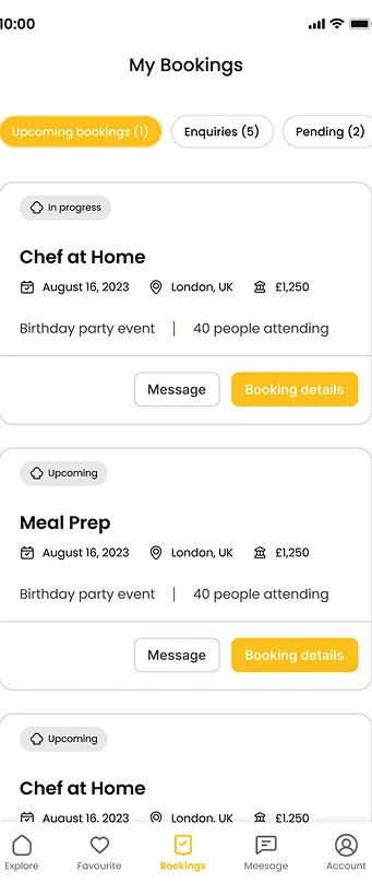
The app lets people browse chefs, adjust a menu, manage bookings and pay. My Bookings is organised into Upcoming, Enquiries and Pending, so a host can see everything at once. Each booking shows its status, date, place and number of guests, with Message and Booking details one tap away.
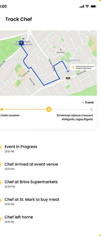
On the day, Track Chef shows where the chef is on a map, with a timeline: chef at the shop buying ingredients, chef on the way, chef arrived at the venue, event in progress. A host who is worried about a dinner for forty people can see it is on track.
Menus that fit the occasion
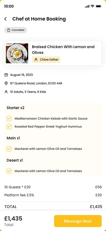
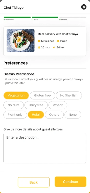
A booking page lays out the menu by course, with starters, mains and desserts, the number of adults, teens and kids, and a clear price: the guests, the platform fee and the total. Before booking, a guest can set dietary needs with one tap, such as vegetarian, halal, gluten free, dairy free or no nuts, and describe any allergy in their own words.
Paying in a way that suits the group
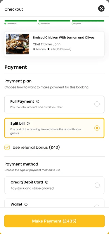
Checkout asks how the booking should be paid. A host can pay in full, or split the bill, paying part of the fee and sharing the rest with guests. A referral bonus can be applied, and payment is by card or from a wallet. Money is the moment people trust least, so the screen shows the plan and the method one after the other, with short explanations.
One look across web and app
The website and the app share one visual language, so someone who finds iKooK on their laptop and books on their phone isn't relearning anything. Throughout the design I ran usability tests and feedback sessions, then changed what confused people.
outcome
The new website is live at ikook.co.uk, along with the iOS and Android apps.
lessons
Show the whole event, not just the booking. People hire a chef for a day that matters to them, so tracking and menus matter as much as checkout.
Make paying flexible. Groups already split bills between themselves, so the checkout lets them do it in the app.